Paint Techniques that will Transform your Home
Why they work and how I painted my long, awkward hallway.
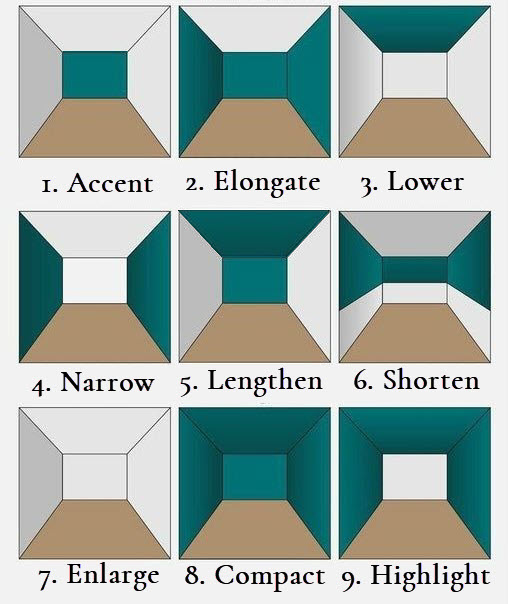
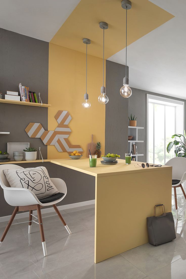
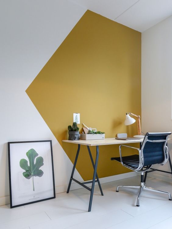
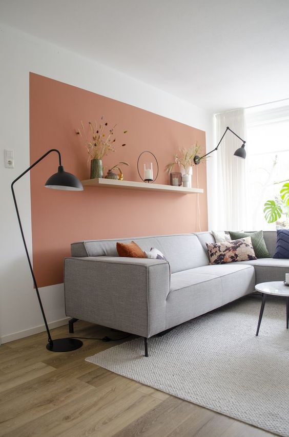
If you’ve been anywhere close to a Pinterest DIY board (and since you’re here, I’ll assume that you have) you’ve likely seen a version of the below visual showing the major impact that paint can have on a room.
Follow me on Pinterest to see all the inspo I gather for my projects and blogs like this!
The two most traditional paint techniques are using color on the walls only, keeping the ceiling white (example two, above) which makes the room appear elongated or painting everything white/light which visually enlarges the space (seven). Example six is also pretty standard for houses that have chair railings or decorative trim.
Two other techniques that have been popping up recently are painting just one wall an accent color (one)- which can also elongate or shorten the room based on how large the wall is, and painting the walls and the ceiling for a compact, cozy feel (eight).
Accent walls are the trend that got me to finally start to DIY but I’ve still never actually completed a traditional accent wall. One of my first, and most popular projects I completed was my shiplap fireplace that accented just the vertical fireplace from floor to ceiling. I’ve also dabbled in wall accents like this board and batten and peel & stick wallpaper.
How these paint techniques ‘work’ to change your perception of a room
Paint is one of a few interior design elements that can directly fulfill any of the seven principles of interior design. Below, I’ll show you the most common techniques for paint, and why they change our perception of the room based on these principles. As a refresher, here are the seven principles of design:
Balance, Harmony, Rhythm, Proportion, Scale, Emphasis and Contrast.
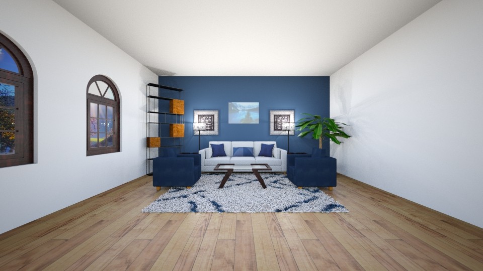
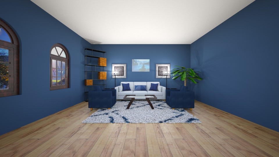
Accent
Painting the back wall a dark or distinct color uses emphasis to draw your eye to that wall first and then contrast to provide an accent that makes the wall feel closer to you. This is a great option for bedrooms with an obvious focal point (the wall with the bed on it), or large living spaces that are in need a defined focal point especially if part of an open concept home.
Elongate
Painting all the walls a color and leaving the ceiling flat white is probably the most traditional method in the US and there’s a reason why it’s so popular, it creates balance.
The two-tone technique produces a sense of containment while the light ceiling ensures that it doesn’t feel cramped by reflecting light, giving the perception of higher ceilings. This style can be used anywhere, but is especially beneficial in open concept areas with multiple rooms that don’t have obvious break points between them.
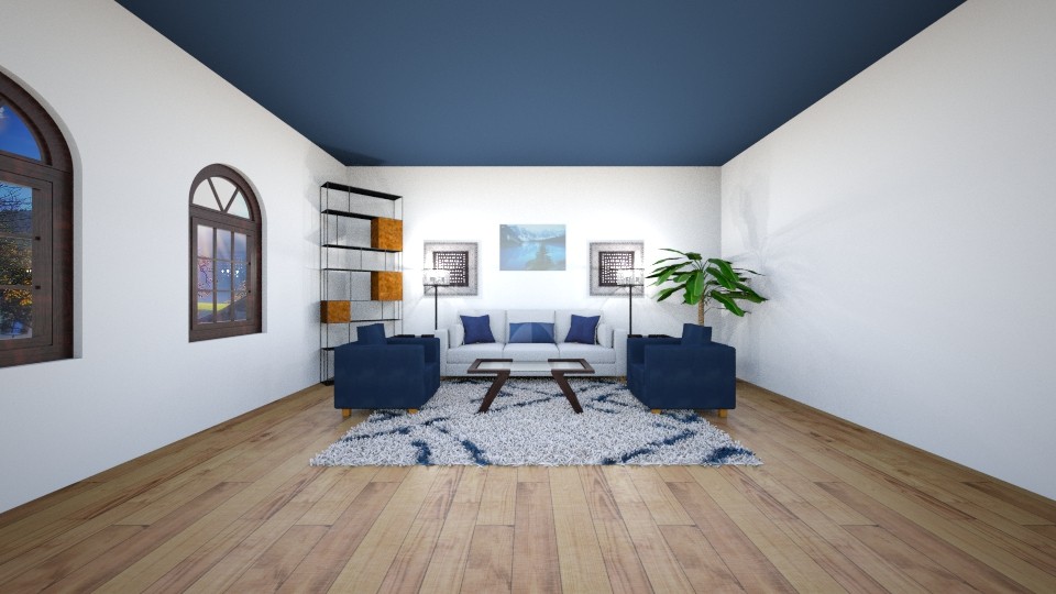
Lower
Painting the ceiling a dark or distinct color uses emphasis to draw your eye up first. Darkness is more noticeable in your peripheral vision, so as you’re in a room with a dark ceiling, you’re eye remains aware of it, making it appear lower, and closer to you. Try this in a formal dining room and balance it with light and airy furniture and decor. It will make the room feel a little cozier and more intimate without going too dark.
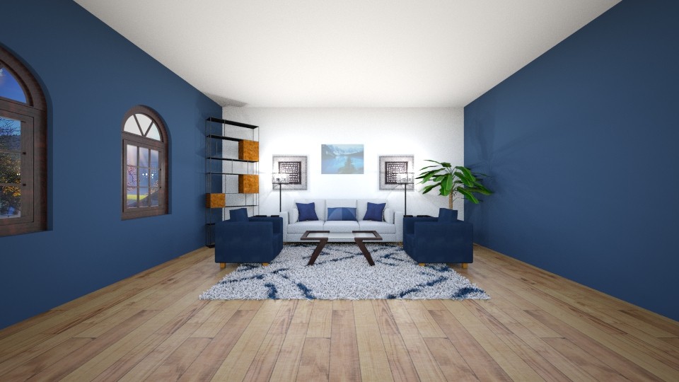
Narrow
Painting two opposing walls in a contrasting color creates visual rhythm that keeps your attention moving. Similarly to how a dark ceiling is always in your peripheral vision, these two walls will trick your mind into thinking the walls are closer to each other than they actually are. Try this in a space that might feel too wide, like a rectangular bedroom or large bonus room.
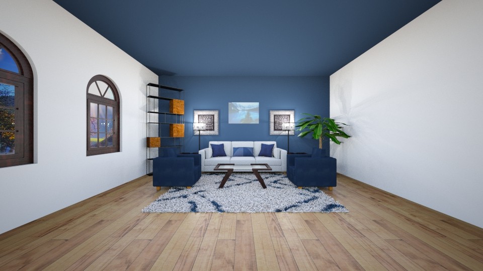
Lengthen
In the exact opposite way of the last style, painting the ceiling and back wall a contrasting color creates rhythm that visually flows instead of bounces. It’s not as easy for your eye to distinguish where the ceiling ends and the wall starts which makes the room feel longer. This style is great for shorter spaces like a small office, closets and entryways or hallways.
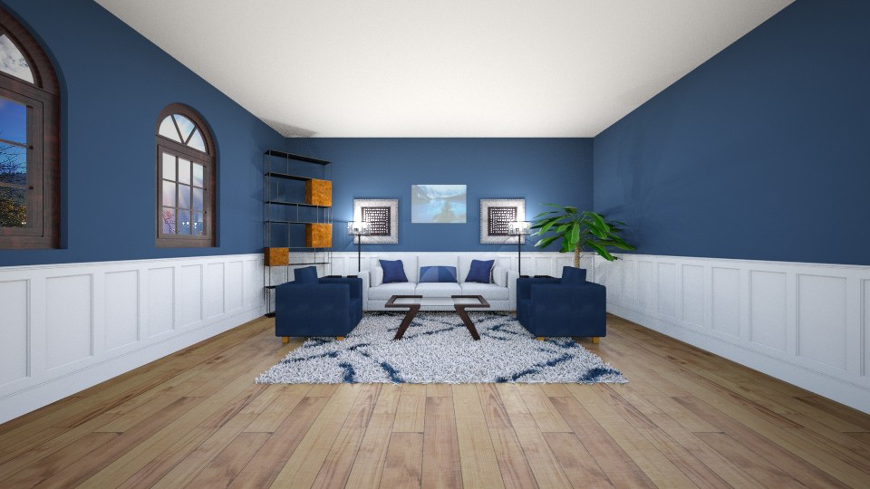
Shorten
Wainscoting or Board and Batten that’s painted contrasting colors has two effects on how you visually take in the room. The continuous horizontal line creates a new proportion to the room, surpassing the original proportion of the walls to the ceiling which makes the footprint feel larger. At the same time, that horizontal line splits the walls in half, throwing off the natural scale and making them feel visually shorter.
This type of molding can be tricky to design around. Try it in a formal dining room and play around with the height of the design. Install it 1/2 way up the wall for square or proportionate rooms or install it 2/3 to reduce the shortening effect.
See how I painted similar molding in my dining room makeover or in this DIY Board & Batten Accent Wall.
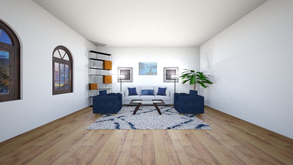
Enlarge
Keeping all the walls and the ceiling light creates a natural balance and harmony in the structure of the room. The lack of contrast keeps focus on the furniture and decor, instead of the architecture. And it helps that the paint reflects light, making the room appear larger. All white rooms are a growing trend but they can easily seem stark and cold. Make sure to use furniture and decor that adds warmth, color and texture to build character.
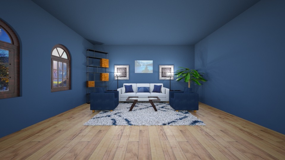
Compact
Rooms painted from floor to ceiling are currently trending (especially in jewel-tones). This technique uses balance and creates a cozy feeling in the room, making you feel wrapped up by the color. Because of the lack of contrast, the darker colors make the room feel smaller and lighter colors make it feel larger.
Try this in in a dining room, movie room, library or office that you want to feel inviting and cozy. I almost went with a full color room for my dining room makeover but I chickened out!
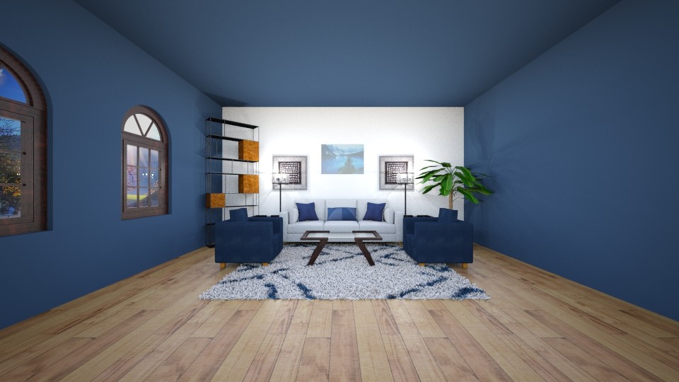
Highlight
Painting all the walls except for the back wall uses emphasis to draw your eye to the back wall, then contrast to highlight the wall and make it appear detached from the rest of the design. This is a great option for busy, functional rooms like a kitchen, office or even a bathroom. The highlighted area provides more light reflection for tasks but still gives you some depth, keeping the room from feeling stark and cold.
Unique ways to use paint that will transform your home:
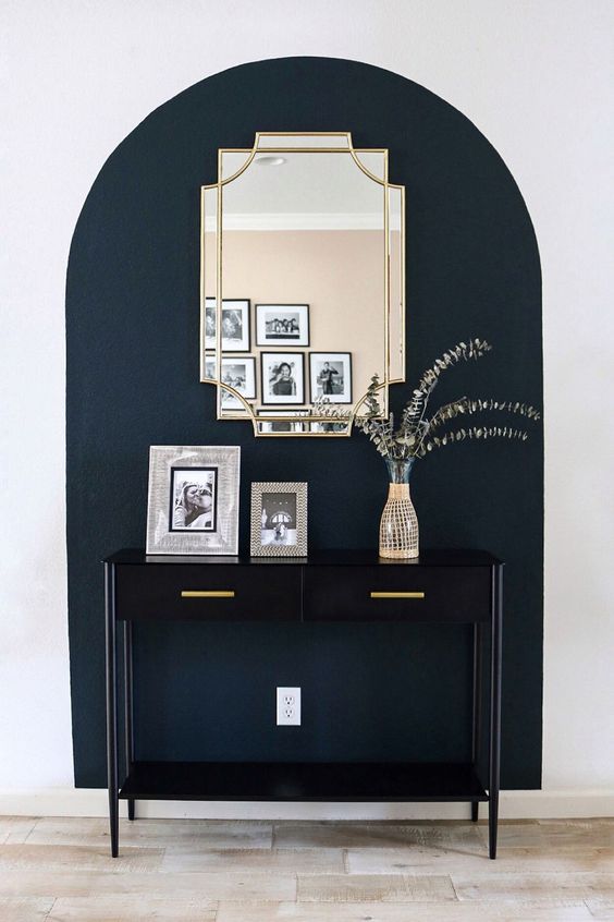
Create an unconventional focal point
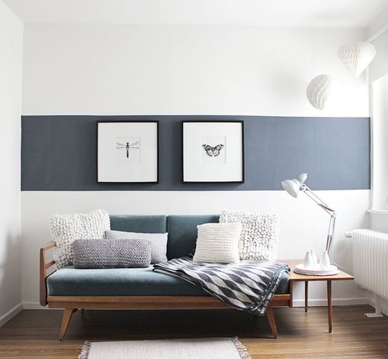
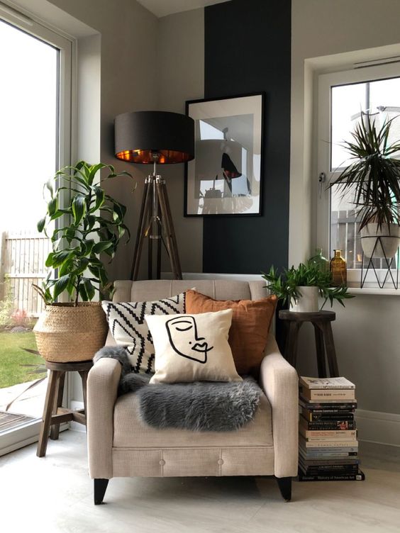
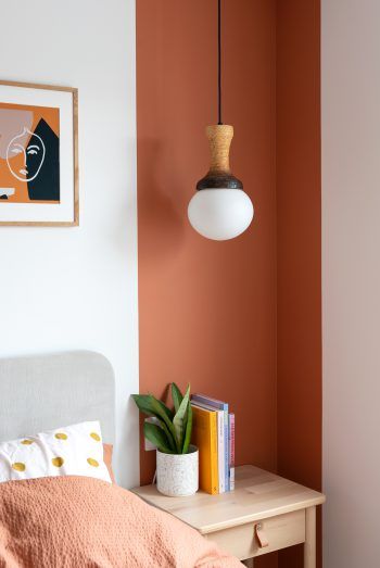
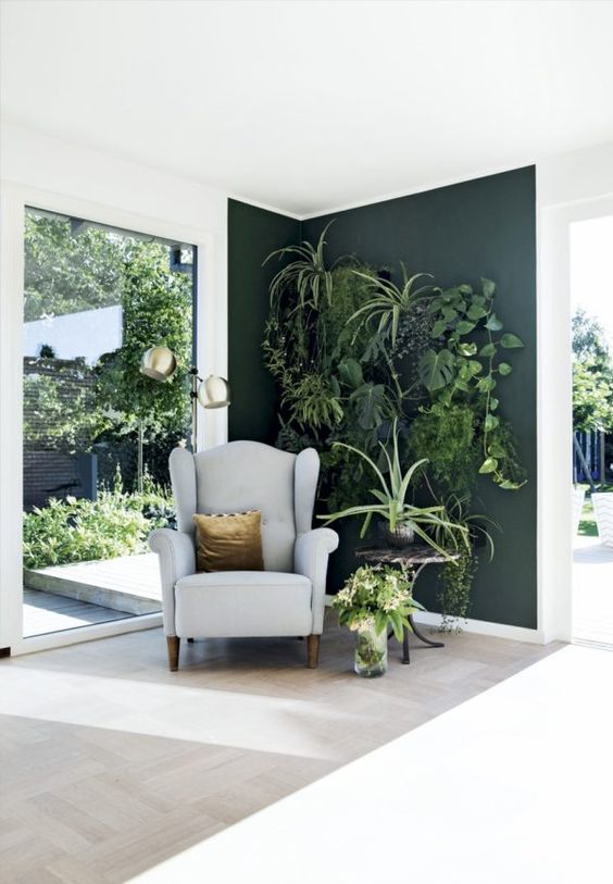
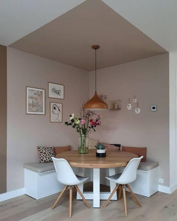
Define a space
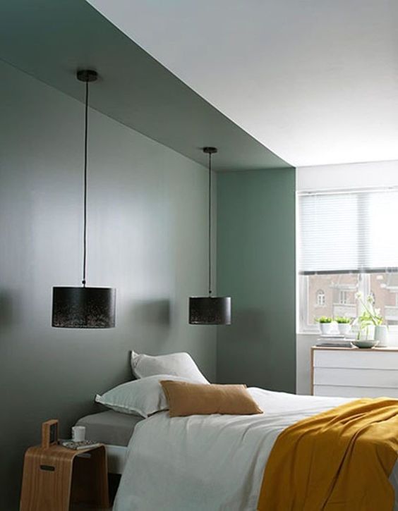
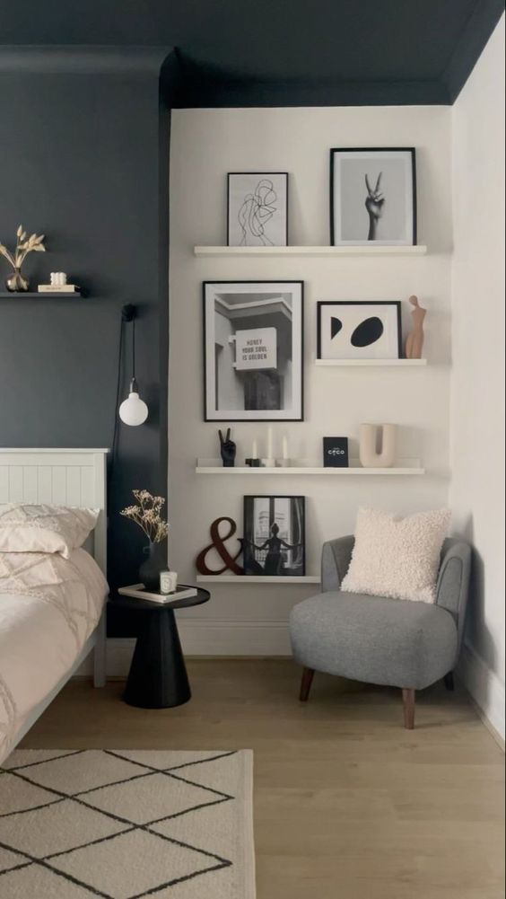
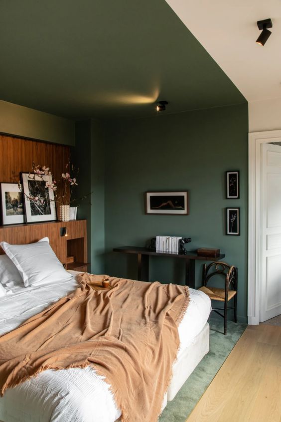
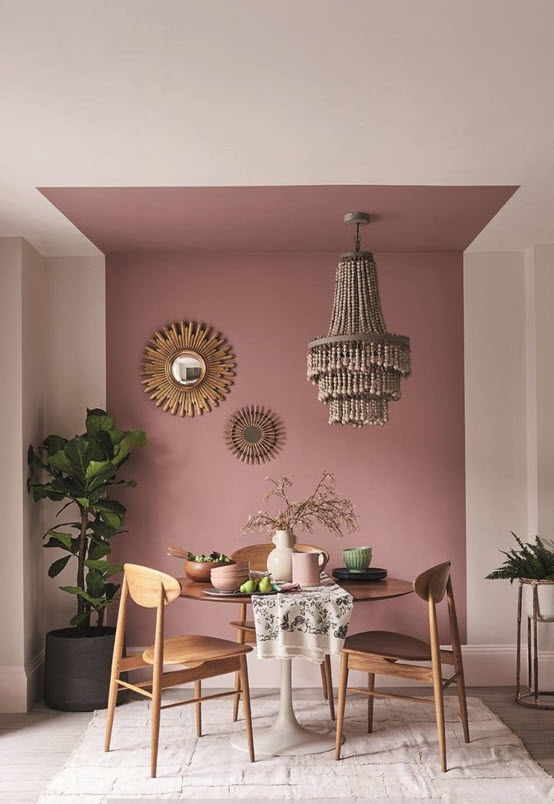
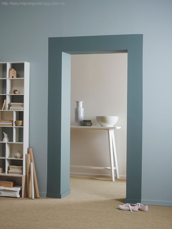
Highlight a window or threshold
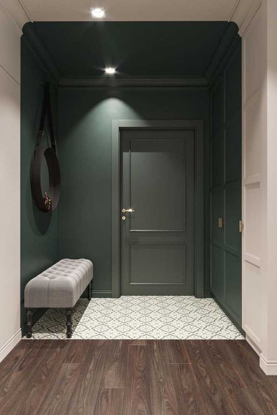
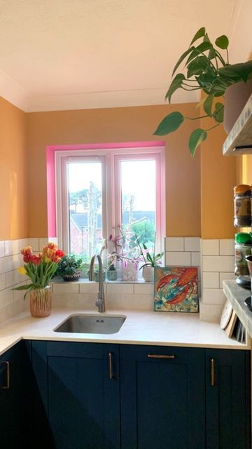
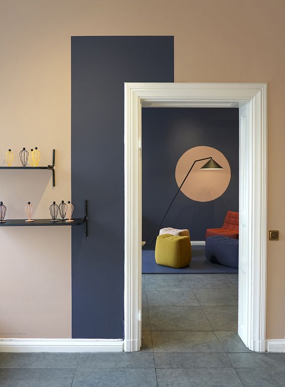
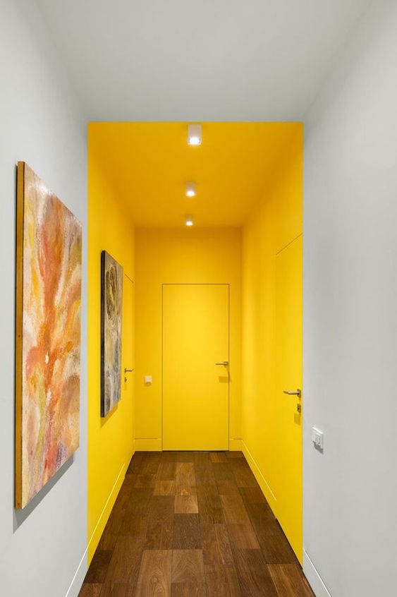
Put emphasis on furniture
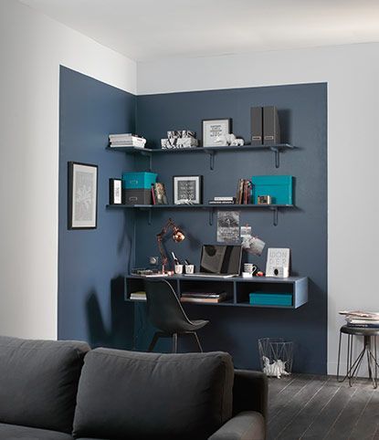

How Paint Transformed my Long, Awkward Hallway
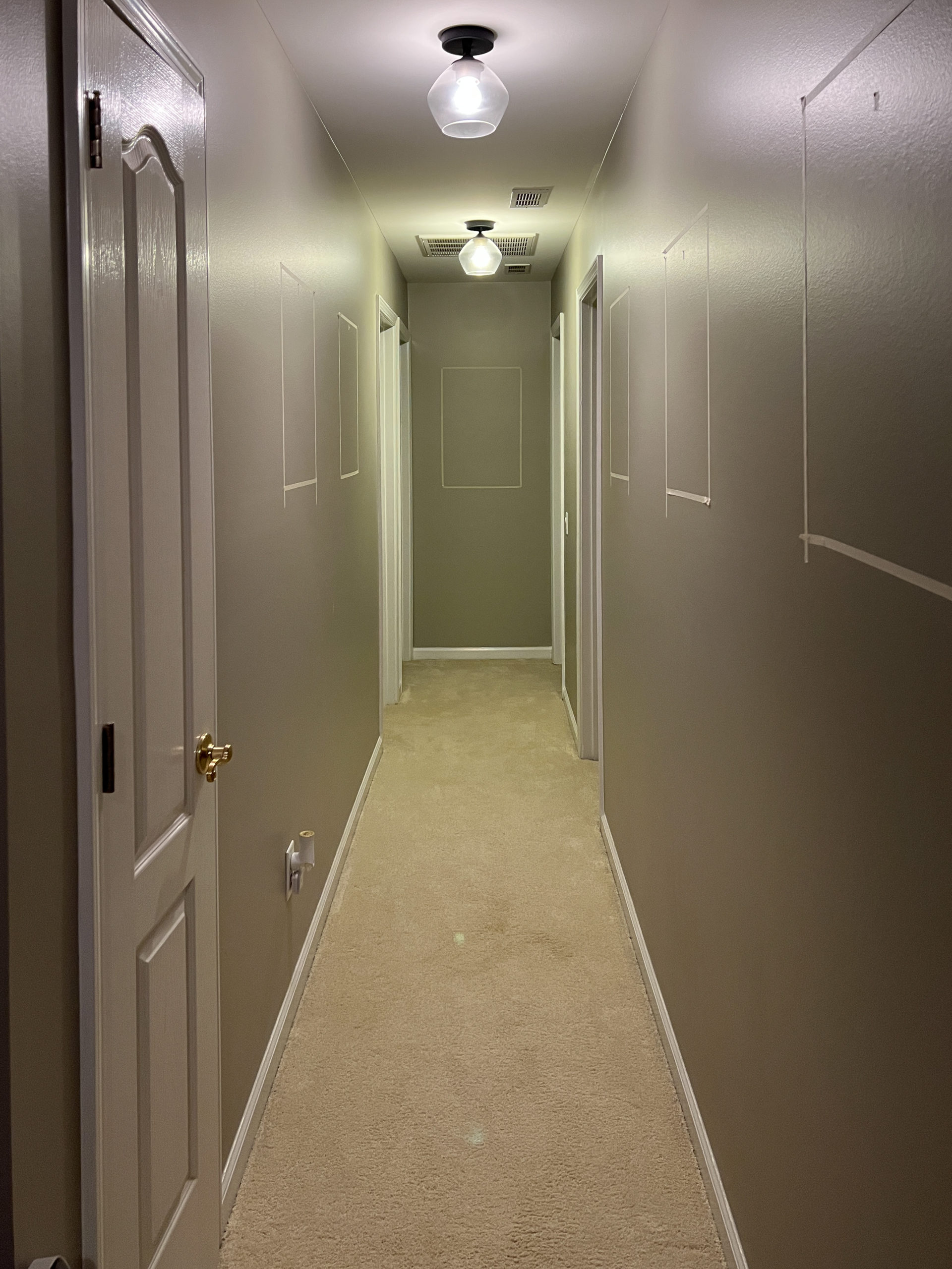
When planning my long hallway refresh, I knew I wanted to paint a dark accent wall at the end. This would shorten the space and also add a pop of color. I went down the rabbit hole of Pinterest (as evidenced above) and decided to do something a little bit different. I came up with a few options- the standard one wall accent and then some arched designs. None of the designs felt quite right.
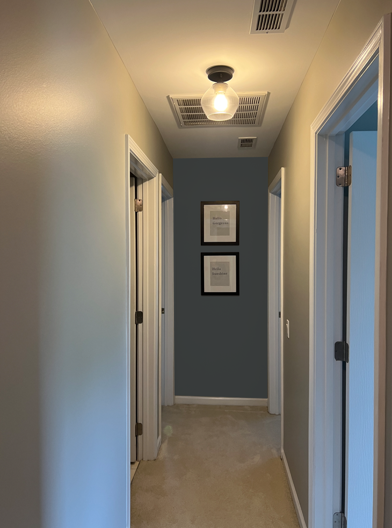
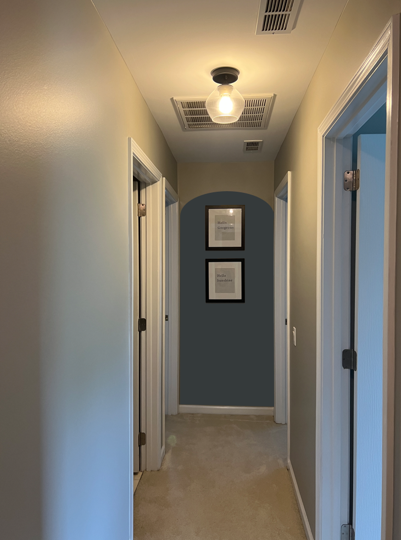
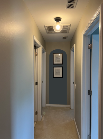
The arches didn’t make sense in my house and while the dark accent brings the wall closer to you, that only helps the issue of the hallway being long, but not the issue of it being narrow. If I could trick the eye into thinking that the back wall was wider, then the hallway would appear larger. I mocked up a few more options.
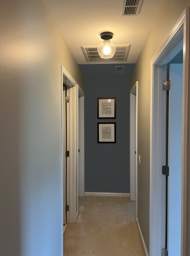

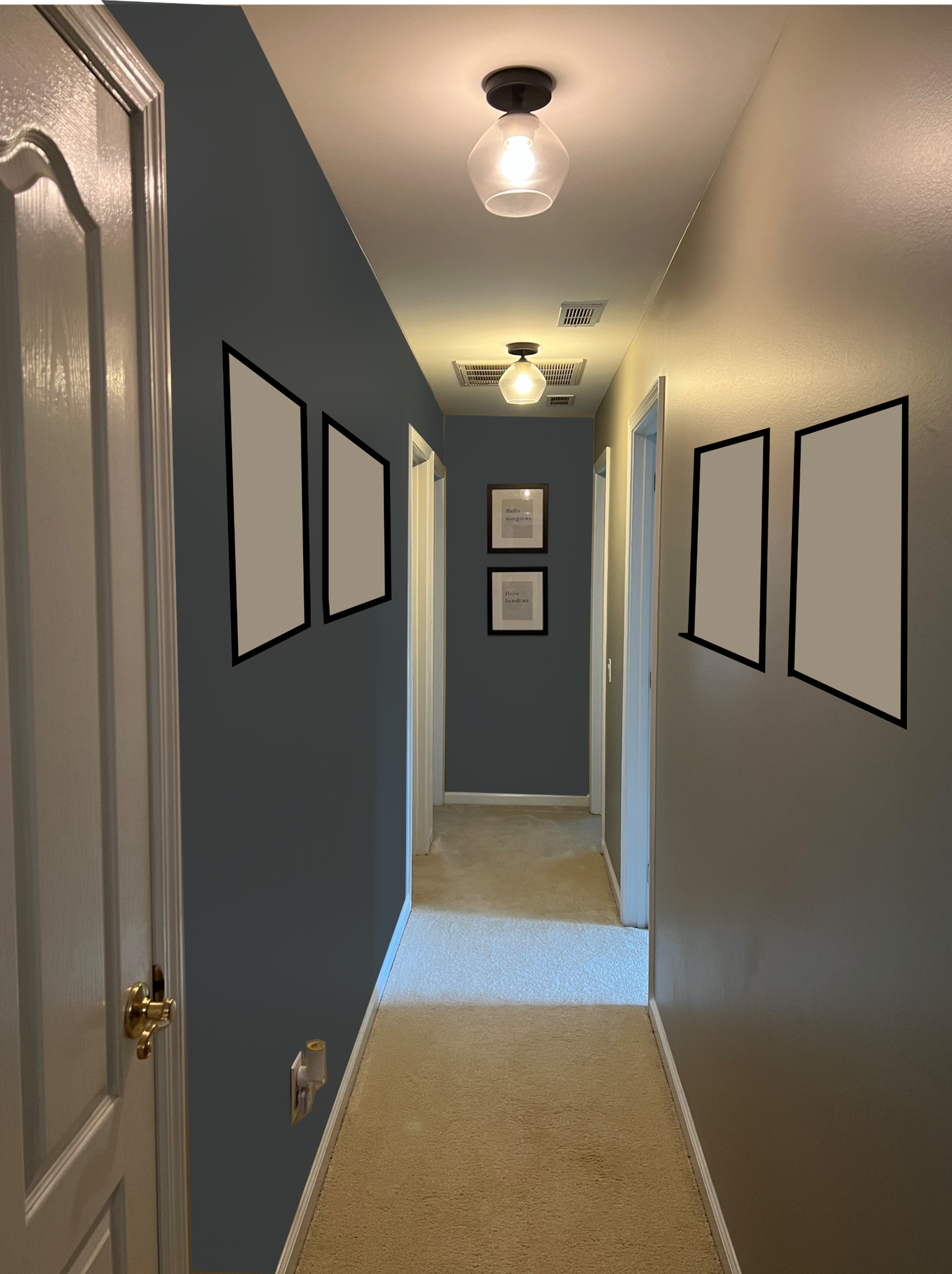
Extending the paint onto the ceiling made the wall look taller, but it still looked narrow. Extending the paint onto the walls made the back wall appear bigger altogether. I was still worried the doors that were butting up against the wall might ruin that strategy. My last mock up included painting one of the side walls but it actually made the hallway look more narrow!
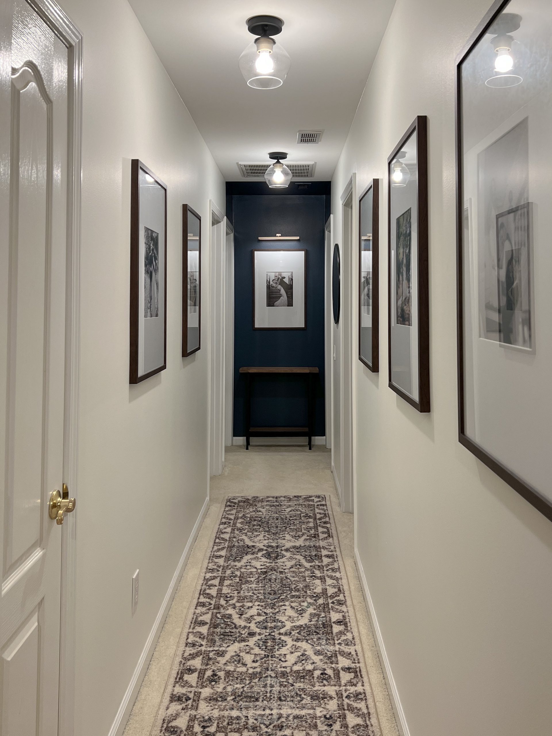
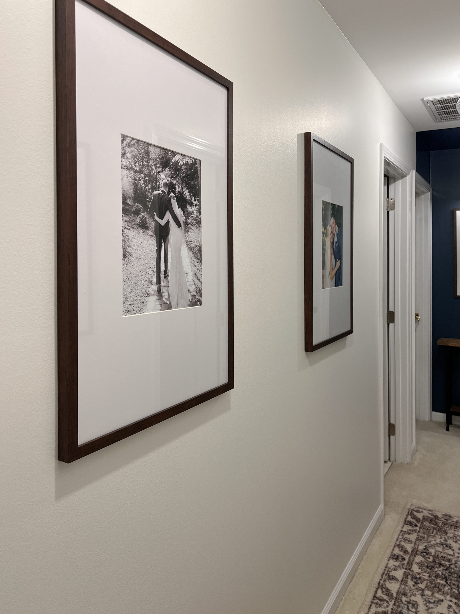
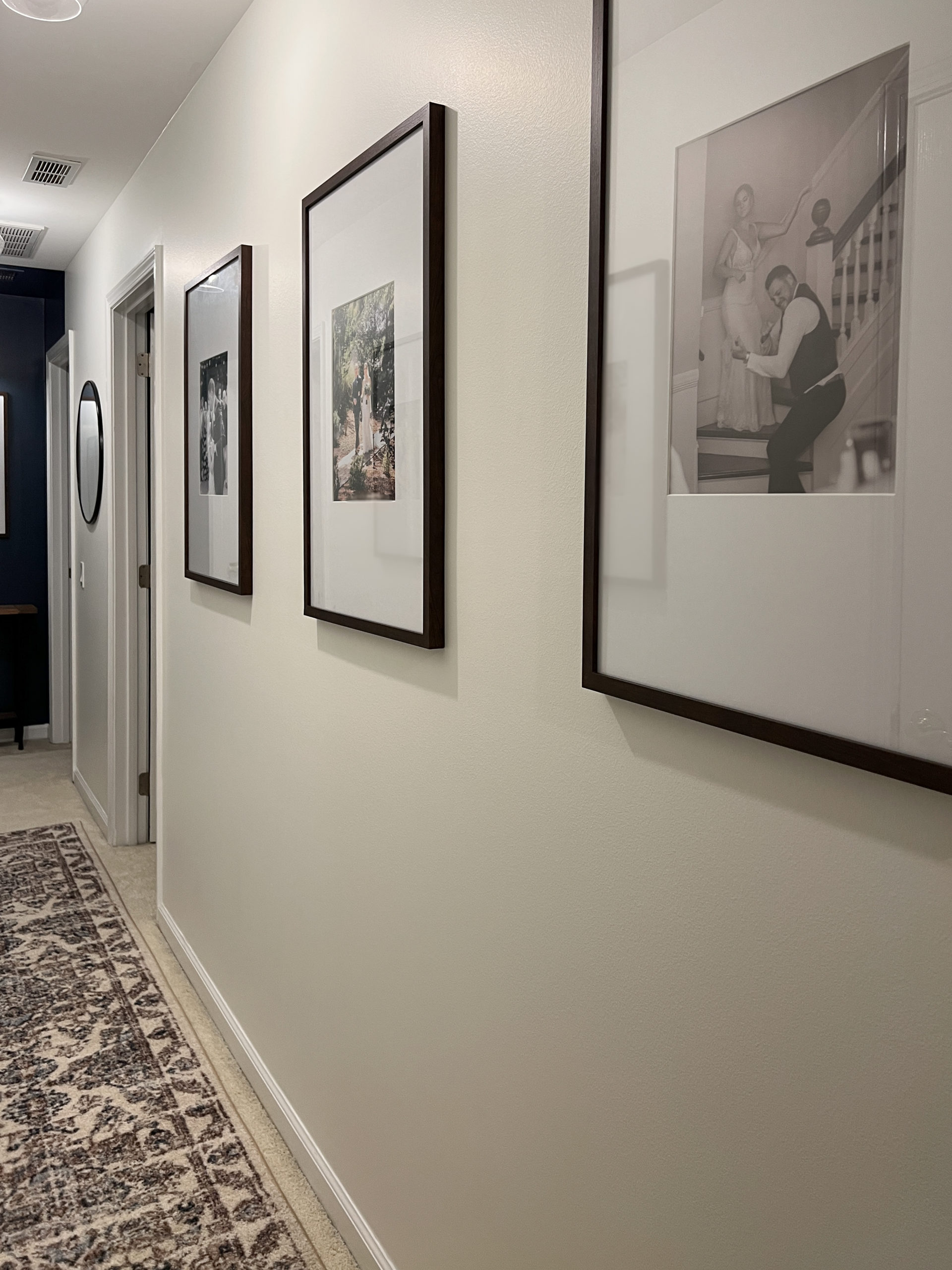
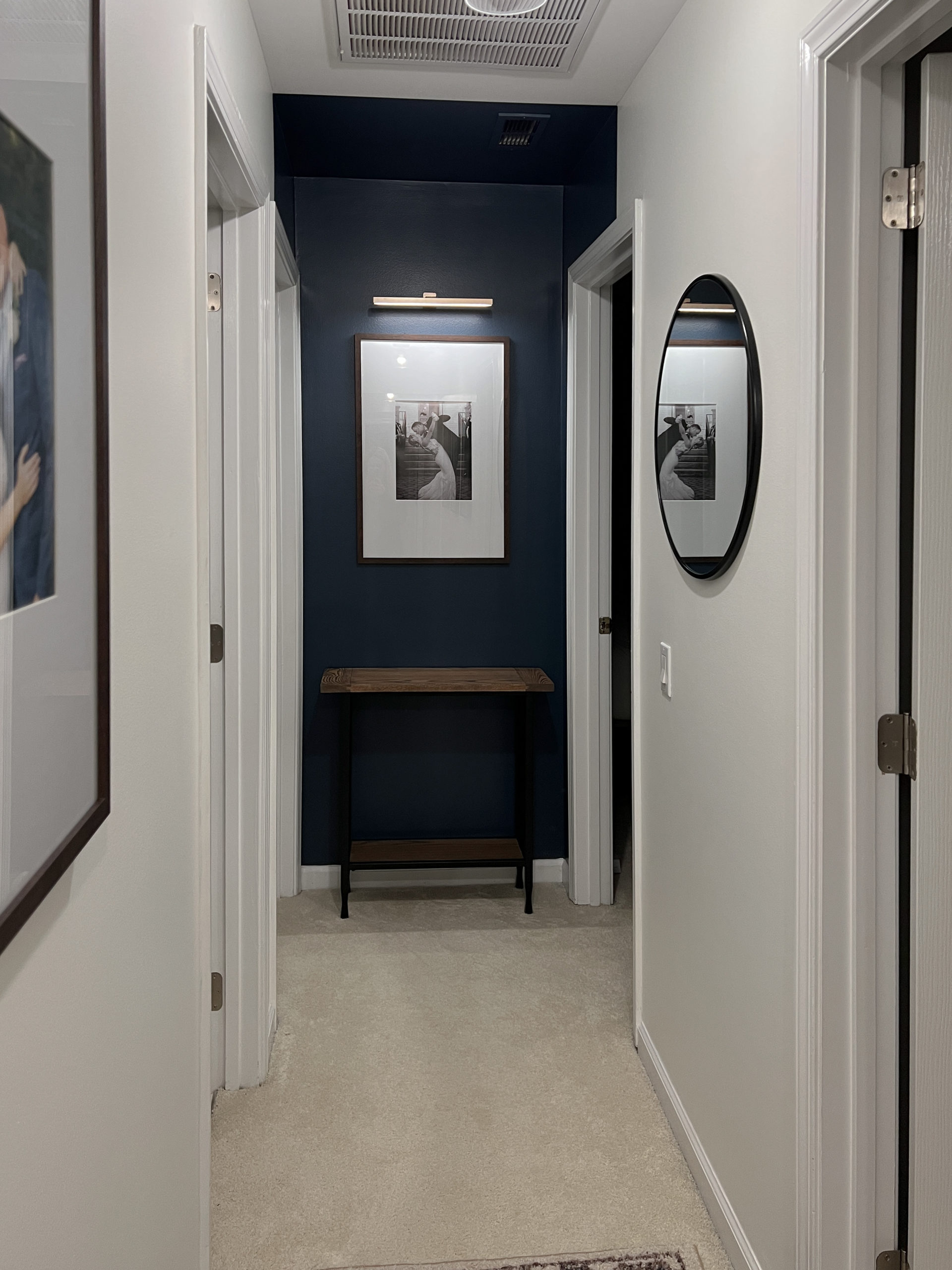
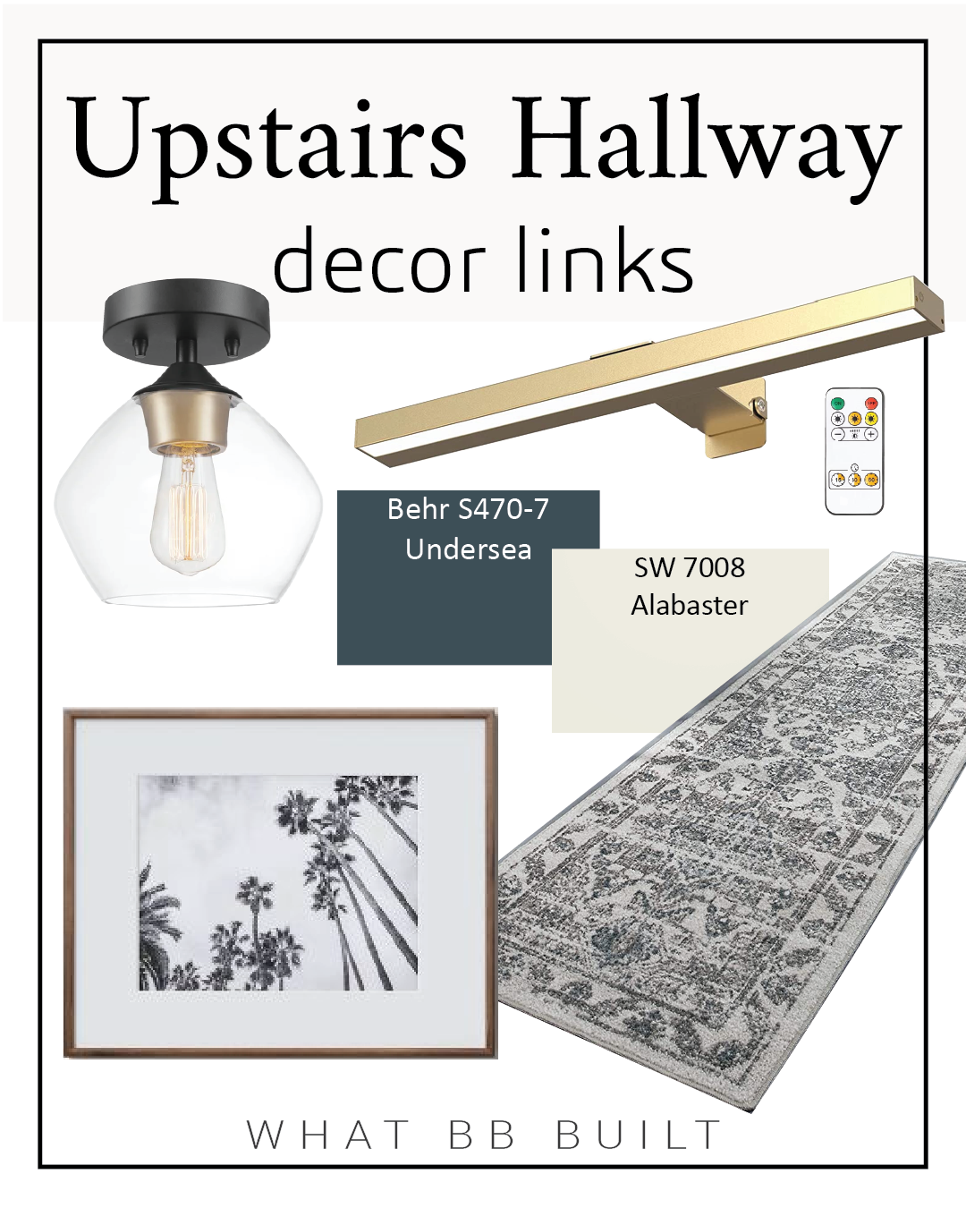
Ultimately, I decided to go with the fifth option. I chose the same color from my dining room, Undersea by Behr and extended the accent onto the side walls and ceiling. I had my doubts when I was painting but it ended up working perfectly.
Final Look & Links
Of course, when you’re focusing on the actual paint and looking at the details, you can tell the hallway is still long and narrow. The way these paint techniques work is that when you take in the entire space as a whole, your perception is altered.
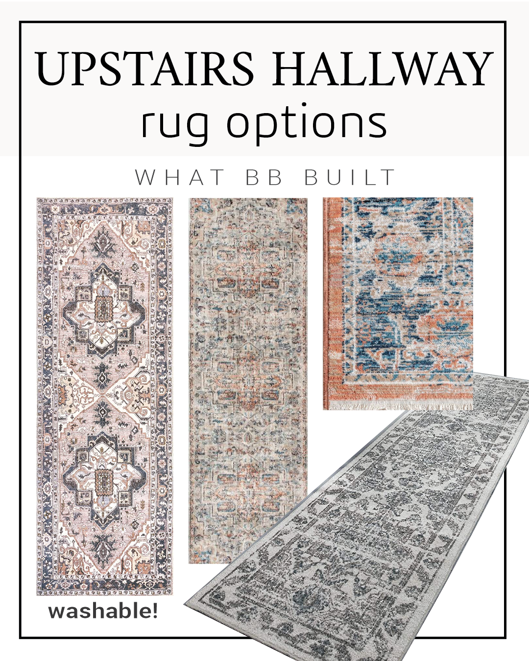
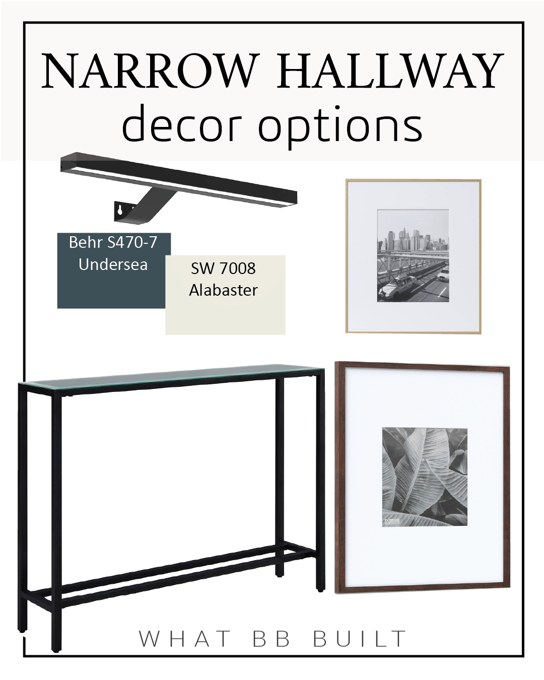
Let’s break down the rest of the hallway refresh. Here are all the angles, the paint colors and links to the decor!

If you have any additional questions about Paint Techniques or my Hallway Refresh, leave a comment below!
Want to keep up with my newest projects? Come hang out on Instagram, Pinterest and TikTok!
Love your ideas and room examples of paint and design. I saved many of these. Curious what color off white did you paint in the hallway?
Hi Stephanie,
Thank you for saving my pictures!! The white in the hallway is SW 7008 Alabaster.
-Rachel
You’ve done an exceptional job of demonstrating how this works, not just recycling the same graphic. I appreciate seeing all the mockups. Thank you!
Hi-
What is the terra-cotta paint color you used on the ‘square’ in the living room? It looks great!
Hi Alyssa,
This picture came from Pinterest but I looked it up and it’s Red Earth from Farrow and Ball!
Thanks!
Rachel
I have the same narrow hallway. I painted the walls withSW Alabaster and trims and doors are SW Pure White. I’m planning to paint my doors with SW Iron Ore to give it some contrast, but debating if I should paint the wall at the end of the hallway the same color as well, but after reading this, I’m not sure if I should. I don’t want my hallway to look shorter. What do you suggest?
Hi Jen!
I love the idea of painting the doors Iron Ore! Since the doors along the hall will be painted, painting the end wall might not have the same effect (shortening) that it would if it were the only contrasting color in the space. If it were me, I would paint the doors first, then live with the space for a few weeks before deciding if it still needed some additional contrast and interest on that back wall. I don’t think you could go wrong either way, it sounds beautiful!
Thanks for reading!
Rachel
Hi how many inches up on the ceiling have u painted and sides
I was going to paint the end wall n all ceiling in my hallway but after seeing ur idea it looks a lot better
I tried sending u a photo of my hallway but couldn’t it’s nearly the same as urs but the kitchen and bedroom door the frame goes right to end of wall I then have a tiny gap then bathroom and closet door then tiny gap which then opens to lounge
Oh end wall has radiator which I can’t move
Hi Tarnja,
I painted about 2′ in on my hallway!
Hi I love ur end result I would never of thought of painting a small portion of the ceiling as u have as I was going to paint the whole of my ceiling and end wall in a dark green which match my kitchen which is next door to my hallway
My question is how many inches have u painted the ceiling couple of inches or quite a few feet and would u paint the walls which have doors very little wall space would u do a light grey same as my lounge wall to match or all white that is the rest of the ceiling doors skirting and wall
If u could advise l be greatful
Hi there! I have a small living room… would it be crazy if I used paint in my living room the way you used it in your hallway? Painting the fireplace wall and maybe 2 feet of the attached walls and ceiling? What do you think??
Hi Mikayla,
I think that would look great! In the examples at the end of the blog, there’s a picture of a bedroom that does this exact technique on a larger room and I think it looks really cool!