Dining Room Mood Board and Inspiration
(This post contains affiliate links which means I receive a small compensation at no cost to you. As an Amazon Associate I earn from qualifying purchases. You can read more about it here. Thank you for supporting my blog!)
Mood Boards. You’ve seen them on Instagram and Pinterest, but you’ve never ventured to trying to make your own. Why would you? You’re not an interior designer. Well guess what?
Mood Boards aren’t just for professional designers (or un-professional DIYers, ahem).
In this blog, I’ll share step-by-step instructions for how I created a Dining Room Mood Board to design a high-impact room update. This project started how all my projects start (and probably how yours start too) – with obsessive pinning of inspiration photos on Pinterest. That’s the first step to making a mood board, so you’re already half way there!
In order to show you how to make a mood board in real time, I’m using my Dining Room as an example. This is my next planned project- so let’s start from the beginning.
Dining Room: Before to Present State
When we moved in, the dining room included a chair rail with picture frame molding underneath it. Here are the original listing photos:
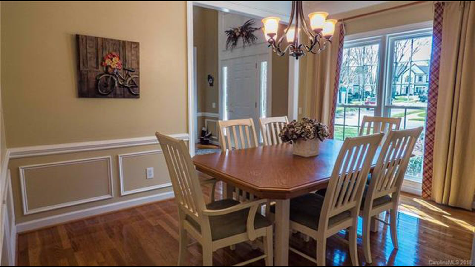
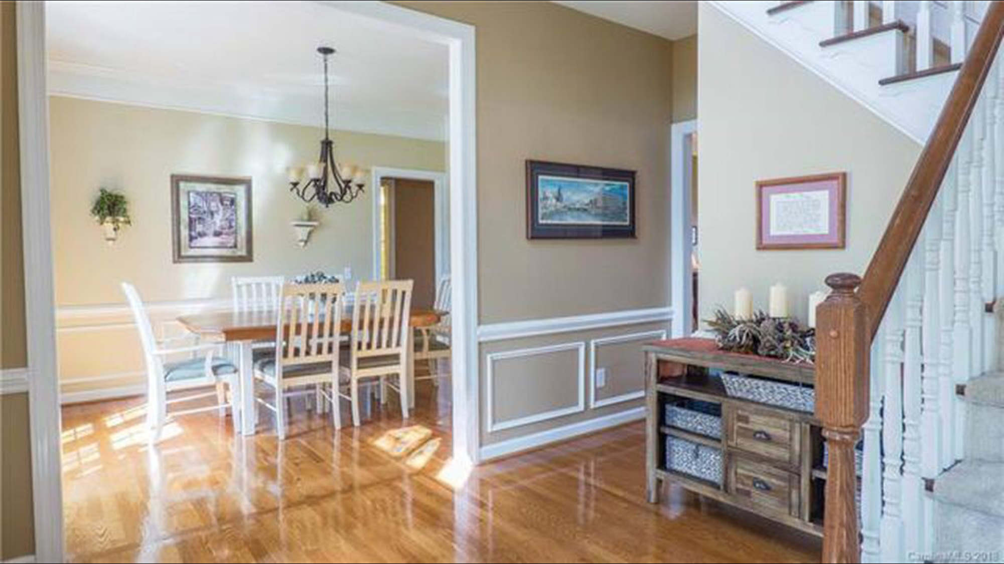
Here’s that same view before we moved in, after we painted the room (SW Dorian Gray) and brightened up the trim . This was a great blank slate, but also still allowed us to leave this space further untouched for a few years while we focused on higher priority projects- like the DIY Shiplap Fireplace project. We barely used this space for two years.
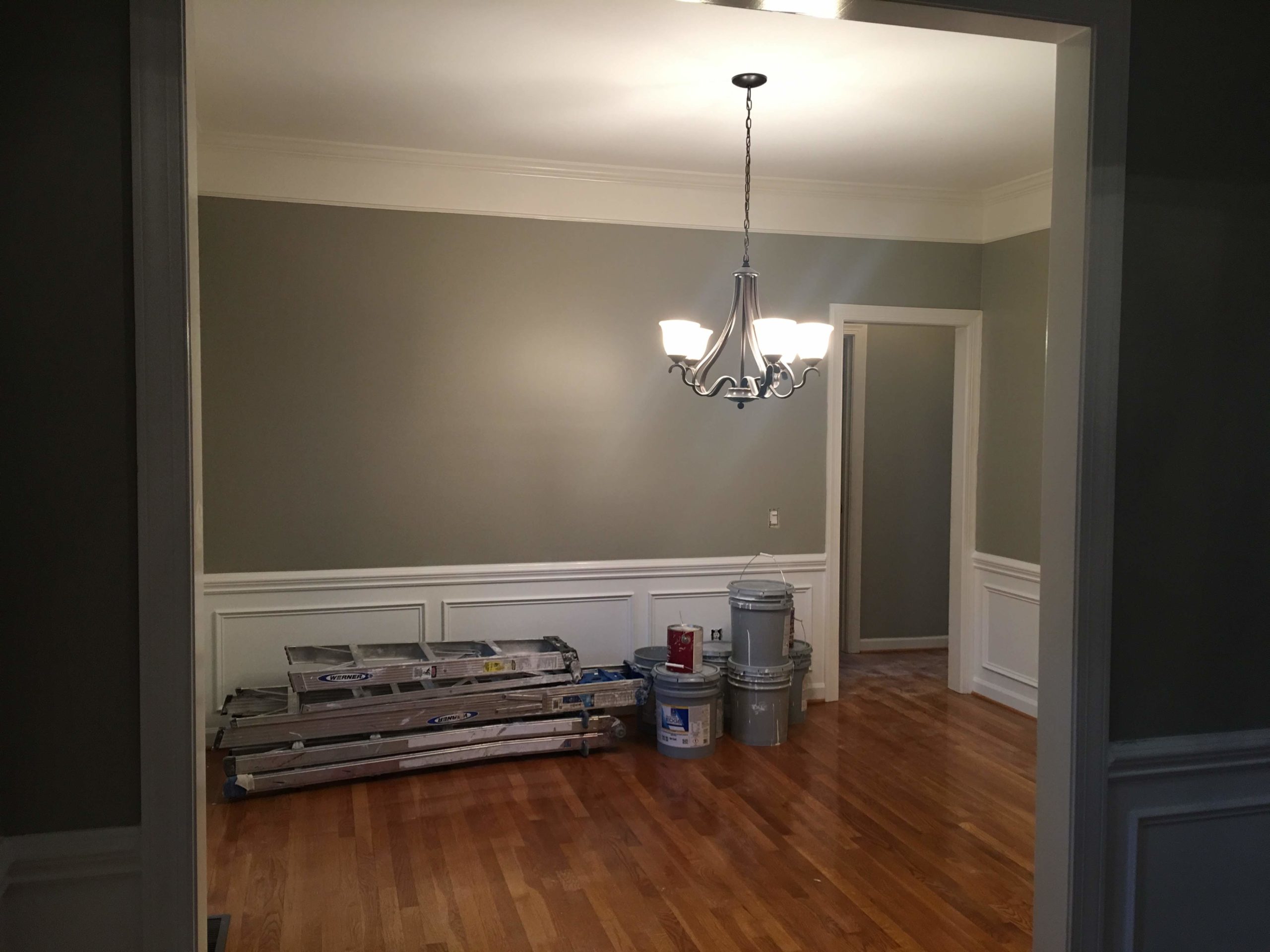
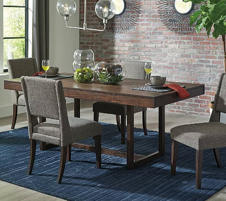
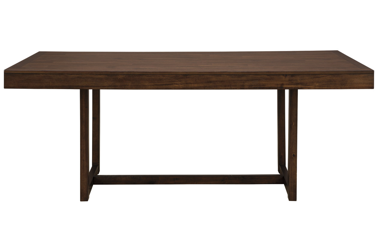
Then came Lockdown in 2020 and Mark needed a space to make his work calls from- so this formal dining room became his office. We added the Starmore Dining Table and chairs from Ashley furniture for his desk and the Lachlan Area Rug from Boutique Rugs.
Now that the world is returning to its pre-pandemic work habits, Mark is back to traveling and this room has made its way up the priority list.
How to Curate a Useful Pinterest Board
Pinterest is a magical place full of beautiful and lofty images of interiors from designers. It can be easy to pin gorgeous multimillion dollar spaces and hard to find images that can be useful for you to use when designing your own space.
To build a useful Pinterest board, focus on images of similarly structured spaces to yours, and concepts that could translate easily. Not only will this show how certain ideas can play out in your room, it can also provide additional inspiration for color pallete, decor, textures, hardware etc.
Here are some of the top pins from my Dining Room Pinterest Board as an example. Click the link to explore my full board.
Similar Concept: Picture Frame Molding
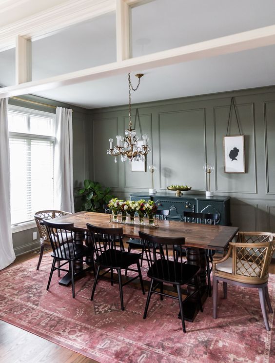
I knew that I loved the existing trim, and wanted to extend it to the top half of the wall. Here are the top images I pinned for that inspo:
The left picture’s trim is extremely similar to mine and the rug in the right picture has similar colors. These images confirmed my decision to add molding to the top wall and paint it all a dark, moody color.
I also got some ideas around the type of light fixture that I’d want in the space. I liked how the black, metal light fixture looks so streamlined and elegant but I’m also drawn to how the white shade is so pronounced against the dark wall. These two concepts seem opposite, but I was able to find a fixture that had a little bit of both design in it and I’m so excited to see it in the space!
Similar Structure: Cased Opening Transition
My dining room will have 3 cased openings- meaning openings to other rooms that are framed but don’t have doors. Transitions for rooms with accent paint are always tough, but cased openings make it even more complex. Depending on your cased opening trim, there’s usually no obvious spot to transition two colors. I decided that the hardest part of this is just making and sticking with a decision. Here are the two pins of accent trim cased openings I loved the most:
Unfortunately, these two pins are exact opposites of each other. The left picture shows the frame of the opening in the non-accent color, looking into the accented room. The right picture shows the frame painted the accent color, looking out of the room.
I referenced these photos and spent a lot of time standing in my opening thinking about this. After a while, I decided that the hardest part of this is just making and sticking with a decision. I chose to match the left photo, keeping the frame white. Worst case, I can go back and paint the trim if I hate it.
Similar Spaces: Dining Room/Trim/Windows
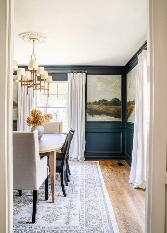
Lastly, I tried to find some images that were as similar to my room and intent as possible, so below are the two top pins for my big picture inspo:
Each image is a dining room with decorative, moody trim and a window. These helped me to visualize how the light would come into my space, and pull together additional details. These are what pushed me to use light, linen-y curtains for my windows. I even played with the idea of using wallpaper or a mural, but decided against it, for now.
Creating your Mood Board
I took all my ideas from Pinterest and created my own mood board for the dining room in Microsoft Publisher. I started by looking up all the existing furniture and pulling pictures of those items from the internet. Retailers will generally have product shots on their website (product against a white background) so it’s easily to remove the background from those images in photoshop, or even microsoft word!
Even if you can’t get the images exact, the mood board still works because it’s not meant to be a rendering of your room- although sometimes mine turn out that way.

I started by getting images of my table, chairs and rug from online, then started pulling a few paint colors I was interested in and making that the background of my slide. Then I started shopping for other elements like lighting, art and curtains and pulling those in as well.
The mood board is just to give you an idea of how the room will work together, and will likely change as you start to bring colors and items into your space. You won’t truly know if something will work out just putting it together on a screen!
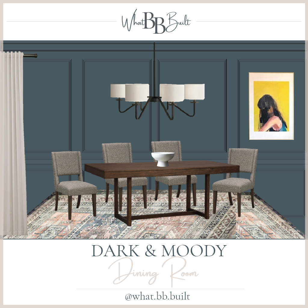
Here’s the final mood board that I’m basing my Dining Room design on. So far I’ve picked out the paint color, light fixture, curtains and a piece of art that I’ve had but hadn’t found a place for. The paint color is Behr S470-7 Undersea tinted in Behr Marquee Satin Paint from Home Depot. Links for everything else below!
Want to keep up with my newest projects? Come hang out on Instagram and Pinterest!




4 Replies to “Dining Room Mood Board and Inspiration”